Web-site restrictions
ACAT is moving to a new website shortly. Due to unforeseen technical issues, the launch has been postponed briefly until Tuesday, 6th May.
In preparation, this website no longer lets members renew their membership. ACAT Administration are likewise unable to process membership renewals until the new site opens.
Please do not update any personal details on your member/friend profile, as changes at this point will not be transferred to the new site.
Thank you for your patience, and we look forward to welcoming you to a new website after the Early May bank holiday.
ACAT Website Gets Mobile-Friendly
The new responsive design for ACAT's website was launched last week and now means that people can use the site properly on their mobile phones and tablets, as well as on laptop and desktop computers.
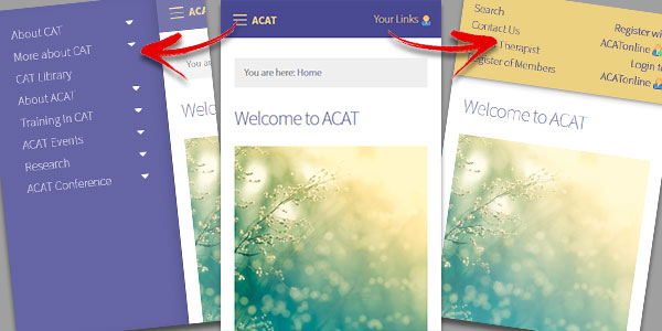
 The navigation is now in 2 parts. One for the main content, which is accessed by the three lines at the top left of the page (on a mobile device only) and a second navigation which is for accessing the site search, therapist lists and login links, which can be found by clicking on the link on the top right of the page.
Contact Us If You Spot A Problem
 The size of the ACAT site has meant that the design update has take a long time to prepare, and it will be a process that continues to evolve as we improve and refine all the site content over the coming weeks and months.
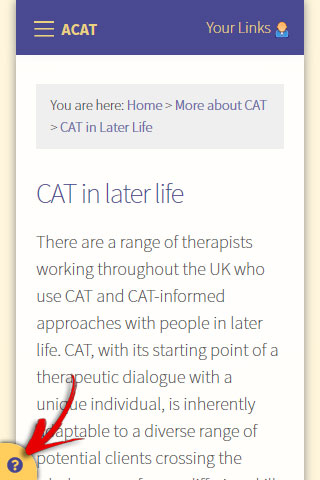
We have put a little Question Mark icon at the bottom left of all the pages. This is for you to use if you spot something that isn't working quite right. You can click on it and send us an email to alert us to the problem and we'll make sure it gets put on the list for our attention.
We look forward to building on these foundations and making the site even more simple to use, and helpful for our visitors, whether they're on a desktop browser, or looking at the site on a mobile phone.
Published by Jon Sloper on 23rd Oct 2018
Other Related News Stories from the Archives
ACAT's Public Engagement Survey & London Meeting in January
Maria Cross - published 21st Nov 2018
CAT for People with Intellectual Disabilities and their Carers
ACAT Administrator - published 3rd Feb 2014
New Research Page on the Website
Jon Sloper - published 25th Jun 2008
ACAT's Credit Card Payment System has been updated
Jon Sloper - published 31st Aug 2021
ACAT Website Design Updates
Jon Sloper - published 18th Nov 2013
Help
This site has recently been updated to be Mobile Friendly. We are working through the pages to check everything is working properly. If you spot a problem please email support@acat.me.uk and we'll look into it. Thank you.


